The Forgotten Greatness of Windows Phone
People that have known me for a long time remember how much I loved Windows Phone. For some time, I was fully invested in Microsoft’s ecosystem. I had a Nokia Lumia, an Xbox One, and a Surface Pro 3. I vividly remember looking forward to Microsoft launches and updates to the ecosystem. I worked in cell phone sales during the height of this fandom and was regarded within my company as the go-to Windows Phone guy. Of course, the years have passed and the operating system is now dead and I have moved on to Android.
But there are always times where I miss things about Windows Phone from an aesthetic of software design to the deep integration that still feels absent on Android and iOS. I was reminded of this, oddly enough, while watching a video on YouTube mentioning 12 smartphone failures and Windows Phone was mentioned. During the time that the presenter was talking about Windows Phone’s failure, there were screenshots of the interface that still feel modern and beautiful by today’s standards. The video got me to thinking about how Windows Phone was an operating filled with potential and great ideas that are largely forgotten today.
The Organized Chaotic Genius of Live Tiles

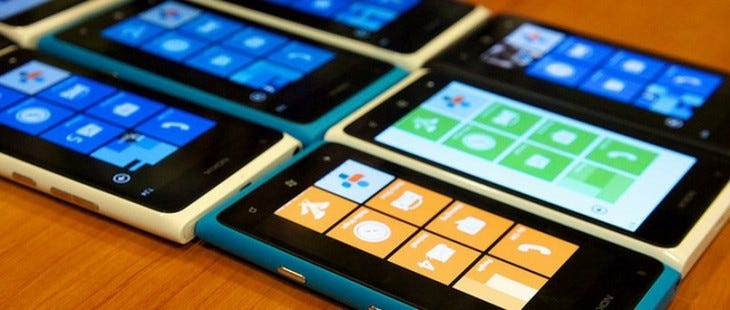
The launch and subsequent success of the iPhone changed the way that phones were designed and approached. With it came the advent of the touch screen as the primary input method on smartphones, and multiple buttons and physical keyboards started to disappear. One of the companies that felt the impact of this the most was Microsoft. When the iPhone was released, the company was defiant. Suggesting that for their niche of a proper business device that the iPhone was a nonstarter because it was not equipped with a keyboard. Microsoft, of course, was laughably wrong and history has not been kind to them for that stance.
Eventually, Microsoft realized that they needed a more modern solution to compete with the iPhone and the surge of Android. As the company was coming late to the party, they needed something radical. And that radical idea was Windows Phone 7. At the time I was a BlackBerry user and fell in love with the idea of what Windows Phone offered. And that appeal started with the Live Tile-based home screen, an experience that was unlike anything else at the time and is still unmatched in terms of usability on a mobile device.
The default layout of every smartphone released since the original iPhone has been mostly the same: a desktop filled with a static grid of icons. Windows Phone decided to change this by utilizing Live Tiles. The idea behind this set up was that the space used by icons can help to deliver information. At first, this doesn’t sound incredibly useful. But having the ability to see weather and forecast on the home screen without opening a weather app, seeing an upcoming calendar event without opening the app, and seeing a preview of an unread email without having to open the email app were great ways to interact with the main screen of the device. There was so much information that was so elegant and laid out differently for each person’s workflow.
In that regard, no two Windows Phone home screens were the same. The tiles were resizable in three sizes: small for just a standard icon, medium for notifications with minimal information, and wide for maximum information on the home screen. On the surface, this type of setup just seemed chaotic. But much like a room with a lot of trinkets and random items, these setups made perfect sense to the user. Live Tiles were unique and an amazing way to make the home screen useful, especially now as most home screens have become more minimal as a place to highlight a wallpaper with whatever icons are in the dock. There was a utility about Live Tiles that was so perfect for a smartphone and nothing from Android or iOS has come close since.
The Unmatched Excellence of the Hub

A problem that Windows Phone looked to solve and did so rather successfully was the plethora of ways that we communicate with people. The People Hub was a way to manage the chaos of so many ways to communicate with contacts. The idea was to aggregate all the ways we contact with friends by linking their contact file with links to their Facebook, Twitter, and LinkedIn profiles. This presented a way to communicate with a contact regardless of the platform easily in one place.
This extended to the news feed of social networks. Instead of having to jump from app to app to interact with friends and followers, the People Hub allowed a clean way to experience these social feeds and to comment, like, and retweet freely all while staying in the same app. This created a streamlined social media experience that allowed for better interactions.
This functionality was augmented by the Me tile. As someone who has often posted the same updates to Twitter and Facebook, this was a godsend. The Me tile allowed posting to multiple social networks at the same time in addition to being able to view notifications from these apps in one convenient place as well. This eliminated the need to hop from app to app and was a godsend for those who are active on multiple social media sites.
Sadly, this great feature was soon to be crippled by constantly changing social network coding that was designed to push the user to the official website or app as opposed to a third party delivery service. As time went on, features for Facebook and Twitter with the Hub started to erode but the idea was one that remains one of Windows Phone’s best. In recent years, BlackBerry has brought a similar idea of this concept with the BlackBerry Hub suite of apps but it is still not quite the same experience that Microsoft pioneered years ago.
The Superior Dark Mode and Theme Engine

This past year, there has been a renewed push from manufacturers to include a dark mode in the software experience. After years of ignoring this feature request, it has become an industry-standard addition. The irony, of course, is that an operating system from the past executed dark mode and theming better than anything out today. Windows Phone from launch included a light and dark mode toggle in settings natively, in addition to having a wide color theming system that applied to the entire experience. This applied to the home screen, all system apps, and even most third-party applications. There was a consistency to the entire experience that is still somewhat absent from dark modes on iOS and Android today.
Windows Phone 7 included 10 colors that could be applied to the entire system and that color count only increased with Windows Phone 8 and Windows 10 Mobile. That baseline 10 color option is more choice than is available today on a Google Pixel. Windows Phone also used a pure black dark theme that saves battery as opposed to using dark gray dark themes that are found on many Android devices. It is astonishing to me that all these years later the efficiency of what Microsoft was able to accomplish here has not been fully replicated by either Apple or Google.
The Industrial Design Revolution
When Windows Phones started to pick up steam in the market coincided with a shift in the way that phones and software were approached. In an era filled with plastic hardware and overly busy hardware, Windows Phone offered an alternative. The hardware brought in an era of industrial design that ushered in more attention to the craftsmanship of phone hardware. At a time when Android phones were using cheap plastics and the iPhone was still finding its hardware identity, Windows Phone offered a higher quality of build to the competition with models such as Nokia’s Lumia 900 and HTC’s 8X.
These devices helped to show phone manufacturers that there was an interest in better-designed hardware and that cheap plastic was not going to be acceptable on the flagship level for much longer. It can be suggested that the design awards and attention that Nokia was receiving in particular for its unibody polycarbonate Lumia line is what eventually led Apple, Samsung, and HTC to use more premium materials in their later releases and to start taking hardware design more seriously.
Microsoft wanted Windows Phone to be a reflection of efficiency and elegance and this started with the way that hardware was presented to the user. Where Android at the time was a mashup of borrowed ideas and developing innovations, and its hardware reflected that. It was only after the Windows Phone market share started to creep up slowly that Android OEMs and Apple started to realize that this was something that consumers wanted and then began to refine their efforts.
On the software side, Windows Phone entered a market of skeuomorphism cartoonish icons and design language. The approach of a more flat and minimal design aesthetic was striking and so very different than what the competition was coming up with at the time. This flatter and cleaner look would eventually take the industry by storm leading to the redesigned looks of iOS 7 and Android 5.0 which have continued to be refined to this day.
Ultimately, Windows Phone failed due to a lack of developer support and an inability to get marquee applications on its app store. I have always thought, however, that as an operating system alone there was none better. The many developments that Microsoft made on this operating system during its very short lifespan have influenced so much of what the modern smartphone is. Even seeing screenshots of the operating system in action from 6 years ago, the operating system still looks current and evokes feelings of timelessness. Looking back at the operating system just makes me hope that another company will take the thoughtfulness of the experience in a future release, to recreate the pleasure that using Windows Phone was to the few people that swore by the platform.